5.16 Introduction to the CLR Case Studies
Free PreviewBy the end of this lesson you will have learned about…
…how the CLR case studies are laid out. The text in grey boxes below is taken directly from Case Study 10. Additional text gives more information about interpreting graphs etc. and relates to all case studies.
- Retrofit Overview
- Interim Conclusions
- Project Information Summary
- Sensor Locations
- Sensor Installation Method
- Analysis
- Summary
Layout of the CLR Case Studies
The CLR case studies in Module 6 are set out in the same format to facilitate comparison between projects. (The intention is also to add further case studies over time.) Here we introduce the rationale and format used in the CLR case studies:
This lesson runs through that format using Case Study 10 – Mineral wool IWI on a cavity wall as the example, starting with an introductory table summarising the key features:

The rest of each case study is ordered under the following headings:
- Retrofit Overview
- Interim Conclusions
- Project Information Summary
- Sensor Locations
- Sensor Installation Method
- Analysis
- Summary
1. Retrofit Overview
This building was previously uninsulated cavity wall. The roof of this building was removed and replaced in 2014 and internal walls became damp from rain moisture. Monitoring started soon after the insulation was installed in March 2015 and it was unheated while building work continued till it was occupied in October 2015. There are 2 proven leaks and 1 further suspected leak but when these are excluded the building appears to be slowly progressing towards drying.
Each Case Study has an overview of the retrofit measures carried out.
2. Interim Conclusions
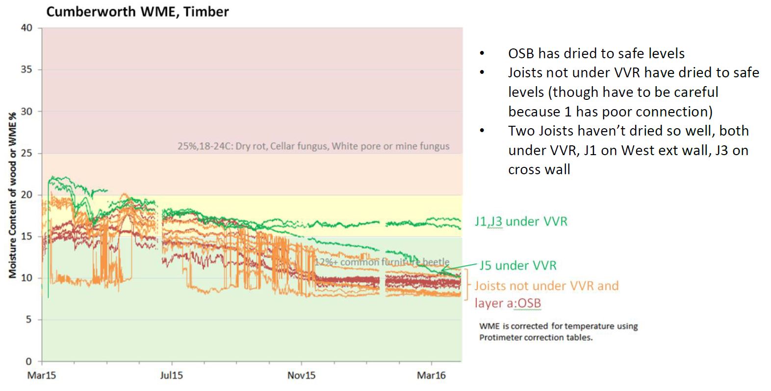
The present condition is currently still slightly damp but it is fitted with an MVHR which is helping it dry out. The construction contains some OSB which supports the insulation, but the risk for this is low because all of it is on the warm side of the insulation. Timbers are generally at very safe levels of risk from rot, though some may be at risk from mould (generally those near leaks).
Apart from at the leaks where some rain moisture is getting in there appear to be no other significant sources of moisture. Glaser predicts a risk from vapour diffusion from inside, but the evidence here shows it has very little effect. Instead the RH is currently responding well to changes in WME.
Section 2 explains the current moisture situation, more detail is given in Section 7 which answers each of the analysis questions individually.
3. Project Information Summary
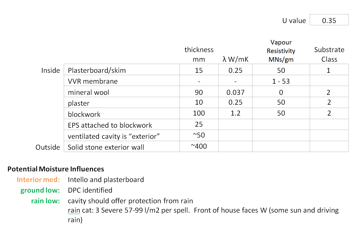
The assembly U-value is shown alongside the assembly build-up and potential moisture influences, as in the table above. Potential moisture influences are rated traffic-light style according the to the severity of their influence: “low” influence is green, “med” (medium) influence is orange and “high” influence is red. High moisture influences (red) are expected to cause a problem in the construction. The text on the right of coloured label gives the reason for the rating.
For example, the influence from the interior is “med”. That’s because Intello has variable vapour resistance depending on the humidity, and when closed it is much less of a vapour barrier than a typical Polyethylene membrane.
4. Sensor Locations
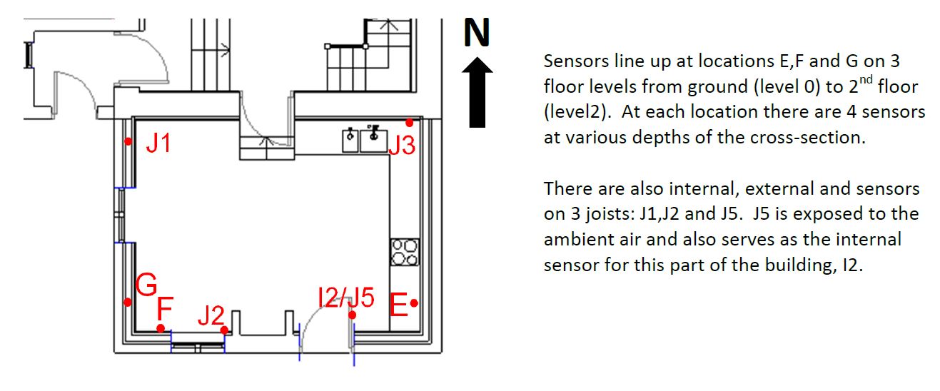
Section 4 gives layouts of sensors. We always have sensors at the highest risk position, the masonry-insulation interface for internally insulated buildings. In this particular example sensors are also arranged in layers at each position, more on this in the next section.
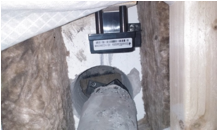
5. Sensor Installation Method
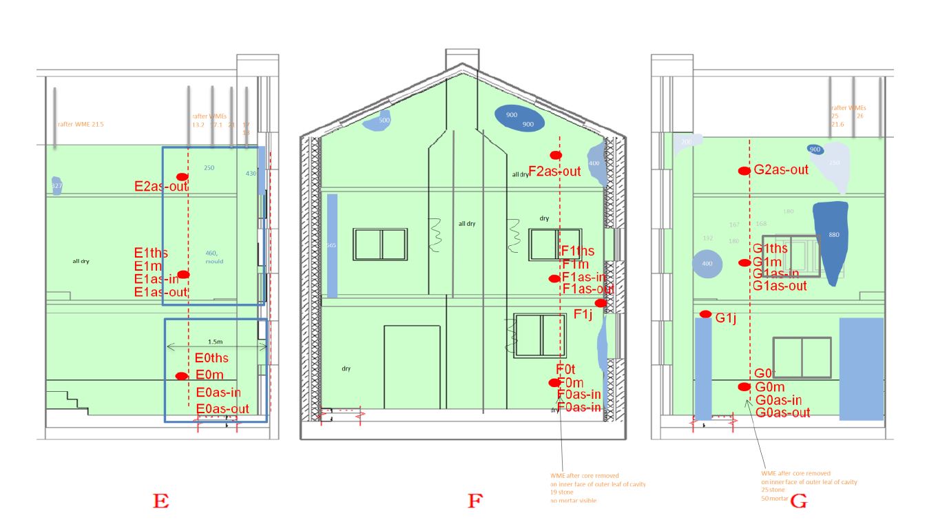
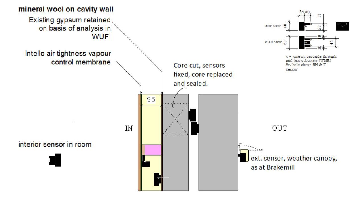
Masonry sensors fixed directly to masonry with no rawlplugs, sensor legs cut short to set body 10mm off face of masonry and set in layers as shown. Timber sensors screwed into OSB without cutting legs. RH and T readings relate to 10mm zone adjacent to substrate. Occasionally sensors in masonry can have poor contact but moisture content readings are for masonry only.
Most sensors appear to be working normally. G1d-as-out on the external side of the cavity has failed and this is a location already verified as a leak position.

Sensors can be installed in slightly different ways. Section 5 describes this, so that readings can be reinterpreted if required.
6. Analysis
- Is the insulation working safely?
1a. What is the moisture content inside the wall?
The WME of the masonry-insulation interface is shown below. Suspected leaks are in grey, most of which have been confirmed by the contractor due to rubble bridging the cavity, the rest are in orange. The moisture content started out quite damp; very likely because the roof had been off during substantial renovation work in 2014 and/or the interior plaster layer is gypsum which absorbs moisture well. It is slowly improving, but is still relatively damp at 25-30% WME.

Cross-sections below show that layer a, the inner OSB remains dry, the airspace has dried the most.
The analysis section is the larges section. Essentially it asks two questions: 1) Is the insulation working safely? and 2) If not, where is the moisture coming from. Each question is subdivided into smaller parts and Section 7 of the report gives simple answers to each of these subquestions.
Above, top. In order to find out if the insulation is working safely we first look at the MC/WME graph. One of the best headline indicators to describe the environmental conditions at points within an assembly or junction is Moisture Content (MC) – or in this case for non-timber materials such as masonry it is known as – Wood Moisture Equivalent (WME). The shaded colour of the background has a precise meaning in timber (see next graph below) for rot risk, in other materials it is more of a guide.
It is interesting to note that across the CLR case studies, the starting WMEs for most masonry walls appears to lie within a range of 20 – 30%. Those that have dried to 10-15% are considered dry. ‘Early cavity walls’ (often misdiagnosed as ‘solid’ or as having metal ties rather than headers bonding the leafs) can also show inner leafs damper than expected, for reasons explored in some IWI case studies.
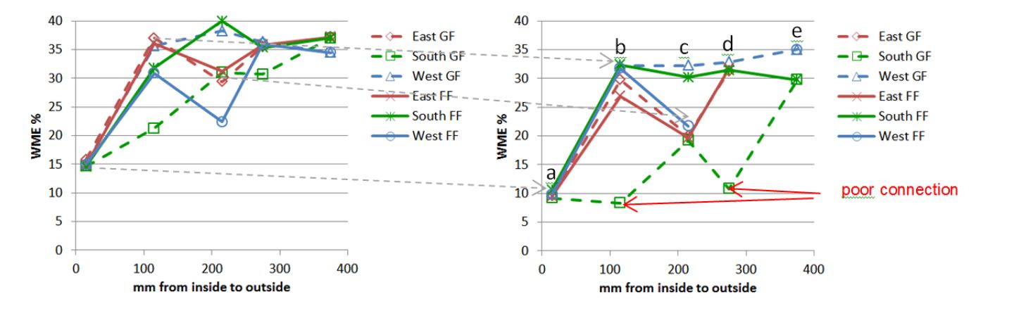
Above, bottom. A small number of case studies have sensors arranged in profiles through the wall. WME readings are then available as profiles. In the example is a cavity wall with layers labelled a-e.
1b. What is the rot risk for any timbers?
Risk zones based on timber moisture content thresholds are indicated by shaded regions: green zone (under 15%) is generally seen as ‘safe’ for timber (although limited populations of furniture beetle may be present down to 12% MC): yellow and orange are ‘marginal’ and above 25% MC timber is considered at ‘high risk’ e.g. from the rots noted particularly so when temperatures lie between 18-24°C.
1c What is the risk of mould?
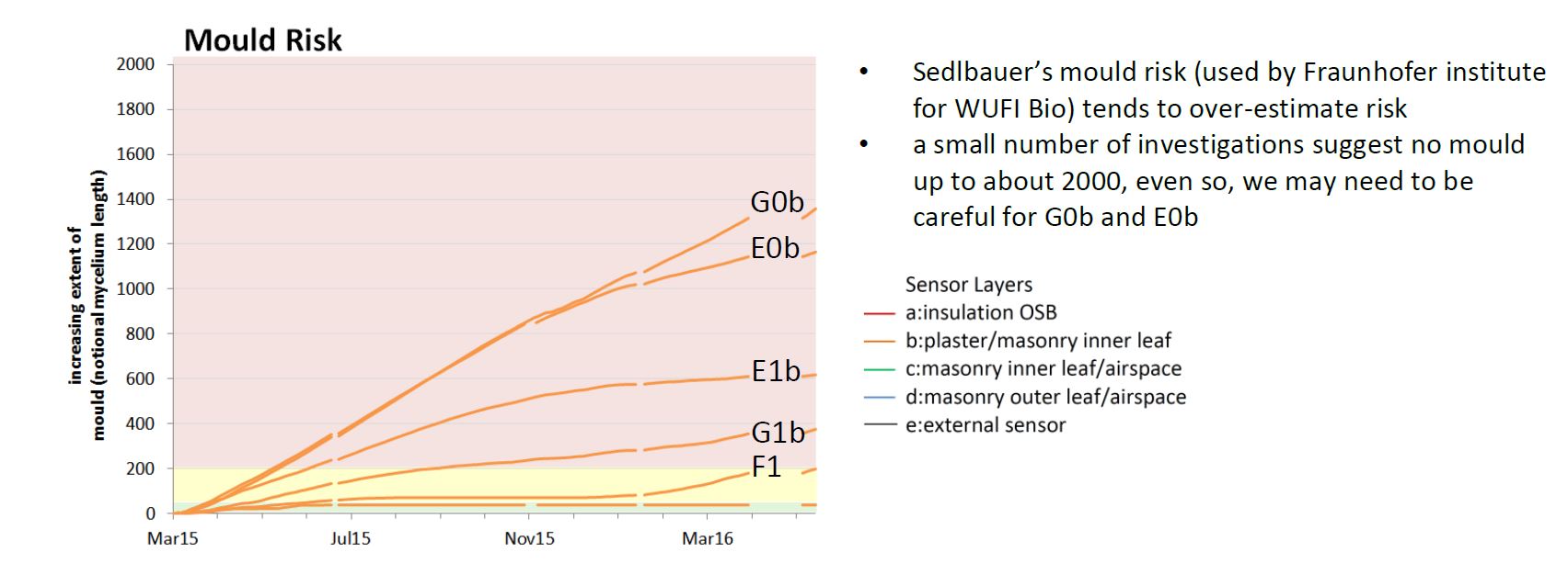
The graph below is Building Regs RH based mould risk, it is only valid near 20°C. It suggests a problem for G0b, E0b,G1b and F1b. However this doesn’t take into account that some parts have lower temperature, as they are on the cold side of the insulation.
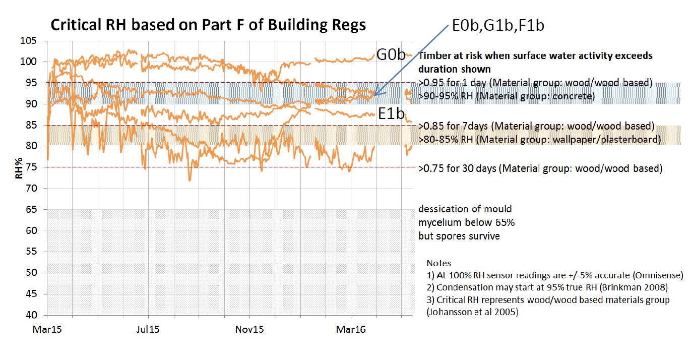
Above top: The RH graph shows typical critical risk thresholds for timber decay and mould growth, some from Part F, some from other sources.
- Part F thresholds are are red dotted lines on the RH graph at 75%, 85% and 95% RH corresponding to surface water activities of 0.75, 0.85 and 0.95 in table A1 below. These are based on an ‘ideal substrate for mould’ where oxygen and nutrients are both present, we have interpreted this as wood, or wood based materials such as wallpaper.
- ‘surface water activity’ is used because this refers to the RH of the air at the surface of the wall where we have sensors, the “Indoor air” RH table would be if RH’s had been taken from sensors measuring average conditions in the room.
- The graph also shows suggested thresholds by Johansson et al 2005 for other materials.
- Other thresholds for mould growth may be used, some use 80% RH as a general limit.
- As mentioned previously, due to margins of error condensation may be occurring where readings show RH of 90% and above, this also affects the accuracy of the mould risk assessment results.

Two tables from Part F Appendix A of Building Regulations showing when timber may be at risk of mould according to RH and surface water activity
Mould risk
An additional graph that is often shown in the case studies is a plot of Temperature vs RH readings with a template describing the rate of mould growth for those conditions, see below. CLR case studies use mould growth figures based on work by ‘Sedlbauer et al 2001 Mould Growth Prediction by computational simulation’ for all moulds in a particular substrate category. The horizontal axis shows masonry-insulation interface temperature (°C) and vertical axis shows relative humidity (%). Dots represent individual hourly average sensor readings for ‘warm side’, ‘interface’ and ‘external’ sensor positions. Both sensor positions in the example above suggest some mould growth potential at different times. “LIM” means the ‘Lowest Isopleth for Mould’ below which there is no growth, but the mould is only killed if it goes below 65%RH.
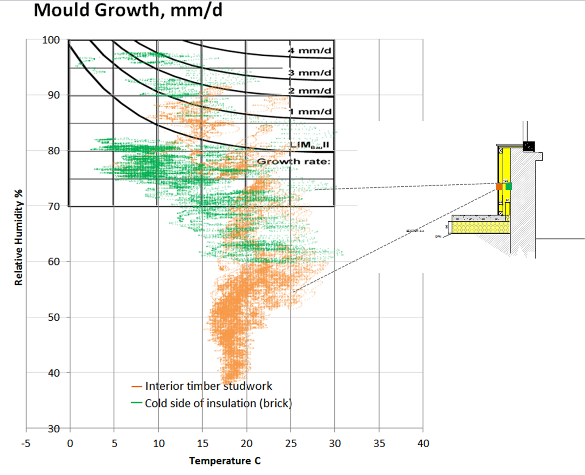
There are 3 categories of substrates according to their sensitivity to mould growth, we use the appropriate category for the material at the sensor position. The overlay diagram of mould growth rate above is for Sedlbauer for Cat II substrates, “Building materials with porous structure such as renderings, mineral building material, certain woods as well as insulation material”. If the substrate was wallpaper, plaster, cardboard, or another biodegradable material such as woodfibre then a different overlay would be used (Cat I). It is important for retrofitters to develop familiarity with, and an in-principle understanding of how different substrates at these building assembly interfaces vary in terms of sensitivity to mould growth. An obvious example is realising that damp woodchip wallpaper is much more sensitive to mould growth than damp cement or lime based parging coat, although even dust and small debris left on the latter type surface can act as food for mould.
As discussed above the results shown on the graphs do not necessarily confirm the presence of mould or actual growth rates – but does usefully illustrate the potential for presence and the potential rate of growth in the vicinity of the sensors. Of those cases investigated it overestimates this risk by a safe margin. Thus different projects/assemblies can be compared across case studies on a like for like basis for the purposes of improving robust design practices. The AECB also encourages later investigation and disassembly wherever the opportunity arises!
Trends
The area of concern for the case study example used above is the masonry-insulation interface (shown above as green dots) – the next stage is to look at how the data varies with time, and whether clear trends are present suggesting increasing or decreasing risk – and the characteristics of any trends.

Above: The same readings are used to sum mould growth over time. The notional mould length reached (of an individual plant’s mycelium i.e. the radius of the mould spot) is shown in mm over time. Lines are calculated for various substrate classes. The green line for example shows that mould could have grown on the interior studwork soon after the retrofit while the interface was at a higher WME and higher RH. After about 2 months conditions change and growth stops – the line levels off and stays constant for over 2 years. Conditions mean the mould is dormant but is still alive. Eventually after 16/4/14 the mycelium desiccates below 65% RH and the mould dies. Any renewed mould growth will become apparent as a result of the on-going monitoring and analysis.
- When RH drops below 65% mould mycelia quickly desiccate and the mould dies, but the spores survive and growth will start again once conditions are favourable
- The CLR model allows switching between types of substrate to explore risks relating to different materials e.g. comparing mould growth risk on timber or wallpaper vs. growth on a lime, cement parging or plaster layer.
Visual Validation
Due to the lack of physical validation (deconstructing and taking insulation assemblies off walls and observing conditions directly) there remains in any remote exercise such at this – despite the use of material data combined with actual measured WME, RH and T data – a degree of uncertainty as to whether mould growth does exist and its extent. CLR researchers deconstructing walls to date have been able to confirm in a few instances the (predicted) presence of mould through smell only and visual validation. In addition the CLR mould risk assessment tool has been compared with others and some validation work is underway.
Mould Risk Models
In the United States the American ASHRAE 160-2009 Mould Criteria Model (illustration below) is being revised.
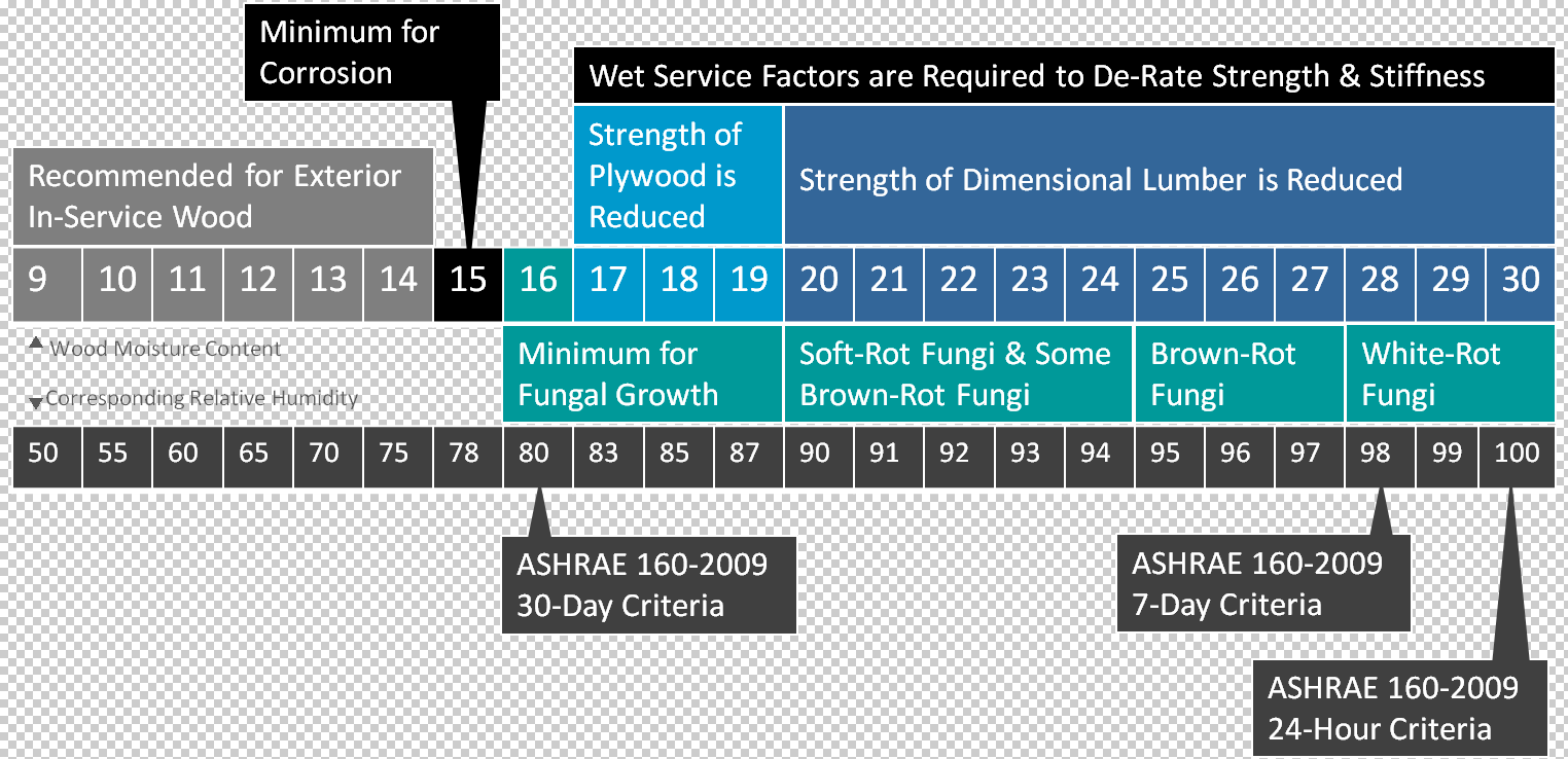
Experiments are being undertaken to help validate the model.

One such experiment (focused on spray foam insulation of double stud timber frame walls) for those interested in seeing the lengths we need to go to in order to improve the fit of predictive tools with reality can be seen here courtesy of the Building Science Corporation (further reading): http://buildingscience.com/sites/default/files/03.02_2015-08-05_ashrae_160_glass_schumacher_ueno.pdf
The AECB Mould Risk Model
Please be aware that the results contained in these case studies are based on analysis of RH, T and WME data from environmental condition monitoring sensors using a spread sheet based mould risk analysis tool developed by Tim Martel & Andrew Simmonds for the AECB CLR programme.
For suspended floors
The AECB has been working with doctoral researcher Sofie Pelsmakers who has been looking at how different mould growth risks are highlighted for suspended floor assembly components depending on the use of three different mould growth analysis tools: WUFI-bio and the (recently changed but currently unpublished) VTT model. AECB is comparing how these interpret members’ project data using the AECB model. Until AECB can more fully validate and potentially align their model with more of its own visual assessments of retrofitted components, or by future collaborative research, a degree of caution is advised as the results for floors may overestimate mould growth risk.
For walls
Monitoring data has been compared to a visual check, a mould smell has been found in mineral fibre (but no mould growth visible) with a mould risk of approx 2000.
For all situations
At this stage in the field of low energy retrofit, while it is not always a good idea to report ‘false positives’ (as people may unnecessarily worry/panic and might not insulate at all despite a low risk approach) – it is better to have an overly cautious tool than overly optimistic when there remain potential issues with the data analysis tools available. Of paramount importance is to protect occupant health, and in doing so, protecting building fabric. Mould growth validation via intrusive investigation remains a crucial part of future research and the AECB would encourage retrofitters to look for opportunities to record and share evidence of mould growth in building assemblies during renovations, demolitions, surveys and retrofits.
Below: Mould/Dry Rot/Fungal Infestation. Rhizomorphs (a root-like aggregation of hyphae in certain fungi) probably from fungi of the type 2 group – found growing between IWI insulation (removed) and a solid masonry wall.
- Woodchip wallpaper (and embedded timber) was left in place during IWI installation
- The wall suffered high moisture loading from rising damp and rain ingress before and after retrofit
- The IWI assembly incorporated an impermeable vapour control membrane.

Below: Mould from fungi of the type 2 group found behind ground floor IWI on battens (lining removed and not shown). This was an insulated lining installed probably in the 1980s on a solid brick west facing 9” brick wall. Insulation was c. 20-30mm thick polystyrene between battens with an air gap behind creating a void between insulation and original wall. Plasterboard was fixed to the battens and plastered. It is unclear if plasterboard was foil backed or whether a vapour control membrane was used – the image suggests some membrane may have been in place on the warm side.
- Wallpaper was not removed
- The insulated lining had air paths linking the habitable spaces to the hidden airspaces between battens via: gaps below skirting boards; recessed wall sockets: first floor floorboards & joists
- Mould shows behind (removed) batten positions and the top right corner is below the first floor where two exposed walls (West & North gable wall) meet
- It is probable that assemblies such as these, with similar conditions in the airspaces behind the linings, mould growth releases spores which enter the airspaces of the habitable areas via the air paths identified.

2. If not, where is the moisture coming from and how?
2a. Rain via capillary flow?
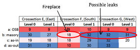
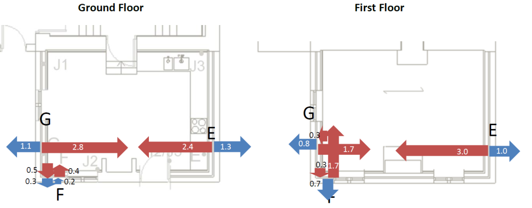
The contractor reported very heavy rain and moisture problems over this winter. In the graph below right the moisture content of the inside of the wall at 3 suspected leaks (grey) rises over time in a similar trend to the WME of the exterior of the wall (black).
In the table below left, much of layer b “b:masonry” is around 30%, about the same as the outside wall layer d “d:as-out”. This might have been because the roof was off last year. Since this is a cavity wall the cavity should be a capillary break; we should see a difference between the moisture content of outer face of the airspace “d:as-out” and the inner face of the airspace “c:as-in”. In two places layer c is as wet as layers b and d. There seems to be moisture bridging the cavity at two of these positions, they all face driving rain. G level 1 is suggested as a possible leak from its behaviour on the graph, not from the figures in the table.
Putting all this together, we suspect leaks at:
South wall 1st floor (F1)
West wall Ground floor (G0)
West wall 1st floor (G1)

The second part of the analysis looks at possible sources and mechanisms for any moisture found. There may be more than one source, so we look at each in turn. In case study 8 we have also compared results to recorded rainfall.
Graph above right: This building has an external sensor measuring the moisture content of the exterior face of the wall. Relatively few case studies have this.
Table above left: This building has cavity wall construction and sensors are at 4 layers within the construction. Part of the interpretation here is a snapshot of WME/MC figures through each of the points and layers. Cells are shaded from dark blue (wettest) through lighter shades of blue and lighter shades of red to dark red (driest).
2b. Inside the house via vapour diffusion?
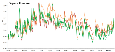
Glaser suggests there could be some interstitial condensation where there is no EPS in winter. However, Glaser is not very representative in conditions with damp masonry and the trend in plaster/masonry inner leaf moisture content (orange lines in RH graph below) does not follow what we would expect from simple Glaser vapour calculations (blue line in same graph).
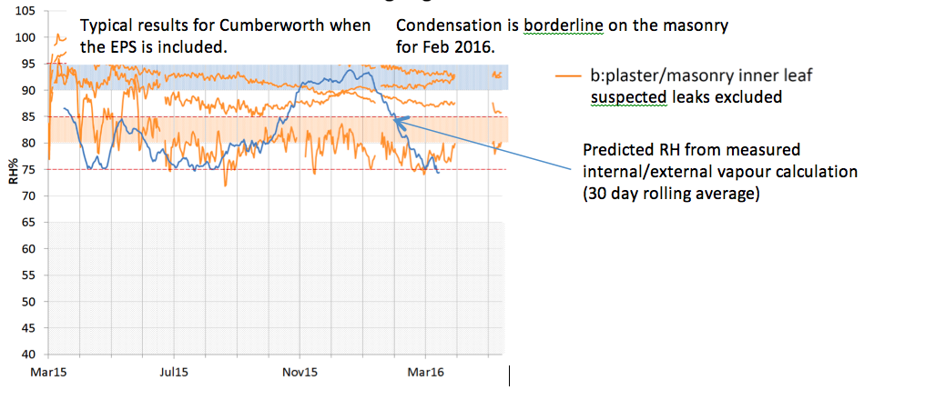
Vapour pressure calculated from ground floor sensors (excluding suspected leak) suggests that since the house was occupied the plaster/masonry layer usually has the highest VP and will dry inwards and outwards.
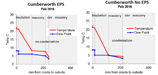
The top graph shows the Glaser calculation. Here is another example in more detail.

- Vertical axis: temperature in Celsius.
- Horizontal axis: distance from the inside (warm) face of the wall – the position of materials is shown (grey lines).
The temperature profile across the wall assembly (red line) shows the predicted temperature at each position in the wall based on the specified internal and external temperatures and the thermal conductivities of each material. Temperature drops more rapidly across insulation (steeper line) and less rapidly across brickwork (shallower line).
The blue line shows the Dew Point (the temperature at which condensation occurs, or ‘100% RH’), this line is calculated using the (measured) internal and external vapour pressures and (standard or manufacturers’ values for) vapour resistances of each material. Where the blue line is steep it indicates more vapour resistant materials, and where shallow indicates more vapour permeable materials.
When the temperature (red line) falls below the Dew point (blue line), the temperature in that section of wall is below its dew point and condensation is predicted to occur. In the example graphs used above the Glaser method warns that there is some condensation likely in winter on one side of the masonry. On this basis a retrofitter may either avoid this build up, or consider a more detailed analysis using WUFI or similar.
Accuracy of Glaser method
The Glaser method is a reasonable approximation of vapour behaviour in constructions using dry materials, for example where an assembly has a reduced moisture loading from rain (reduced via rain protection measures) and rising damp (via damp protection measures). In new buildings this is not always the case, and it’s much less likely in existing buildings. We quote it because people should be using this method at the very least, it is also a regulatory requirement of Building Control and it provides a useful starting point of whether there might be a problem. It is least accurate where there is capillary movement of moisture e.g. rain wetting or rising damp and it doesn’t include the effect of sunshine on walls. It is very useful to be able to see how actual results differ through the case studies.
One inaccuracy is the temperature. Heat from sunshine will warm the inside of a wall above that expected from Glaser, which uses only the air temperature. A wave of heat moves through a wall, delayed by up to 9 hours in some cases, the “decrement delay”, see below left. The blue line is the exterior wall temperature, peaking at 4pm, the green line is the the temperature at the masonry interface which peaks at midnight. Over a year (below right, from case study 1) the Glaser-predicted temperature (shown below as red dots at the masonry-insulation interface) is close to the lowest temperature actually recorded. These higher temperatures reduce the risk of condensation compared to the Glaser prediction.


Graph to show decrement delay Glaser and actual temperatures for inner face of brick
2c. Hygroscopic effect?
WME and RH affect each other in a curve. When two RH lines are predicted (blue lines) from measured WME’s using this curve there is a good correlation with actual RH readings (orange lines). This means the initial moisture content of the brick combined with hygroscopic effects (equilibrium of WME with RH) explain the RH much better than vapour (Glaser) effects.

For these graphs we create a scatterplot of the insulation-masonry interface data of WME vs RH. In unventilated environments with hygroscopic materials such as brick there is often a relationship between the two, points gather along a line. A trend line is created and this is used to create one reading from the other. The graph above shows that this gives RH’s that are much closer to actual readings than the Glaser method. This is consistent with recent hygrothermal research and it will be interesting to see how many of the case studies show a similar result.
7. Summary
- Is the insulation working safely?
a. Moisture content inside the wall is 20-28%WME, 29-32% at suspected leaks, higher than we would like, but it will probably dry within the next year or two.
b. Rot risk for any joists and OSB generally minimal, slight risk for 2 joists.
c. May be some risk of mould, generally where there are suspected leaks.
- If not, where is the moisture coming from and how?
a. Leaks are allowing rain to reach the inner leaf via Capillary Flow in 2, perhaps 3 cases.
b. Little if any from inside the house via Vapour Diffusion.
c. Hygroscopic Effects are strong, RH closely follows a hygroscopic relationship from changes in WME. WME doesn’t seem to correlate much with changes in RH.
Each case study finishes with a Summary (section 7) of the key points taken from the Analysis (section 6), as in the Case Study 10 example above.
Summary
This lesson has described how the CLR case studies are laid out, using Case Study 10 as an example. Information on interpreting the graphs relates to all case studies.